The Australian Bureau of Statistics (ABS) released the latest labour force data today (April 17,…
Australian labour market rebounds strongly after lockdown ends but still 1.6 million (12.1 per cent) without enough work
The Australian Bureau of Statistics released the latest labour force data today (December 16, 2021) – Labour Force, Australia – for November 2021. With most states now abandoning most Covid restrictions just as the new variant arrives, which evades the vaccine coverage and infection numbers soar to record levels (go figure), the labour market certainly rebounded emphatically. Employment growth was very strong and resulted in sharp falls in unemployment and underemployment. Participation also rose, which prevented the unemployment rate from falling more. Overall, this is an improving situation although whether it will last as infection numbers start to rise rapidly is another question. It is certainly time for the Federal government to take advantage of the strengthening situation in the non-government sector and target some really good job creation initiatives in the regions and demographic cohorts that are still lagging behind.
The summary ABS Labour Force (seasonally adjusted) estimates for November 2021 are:
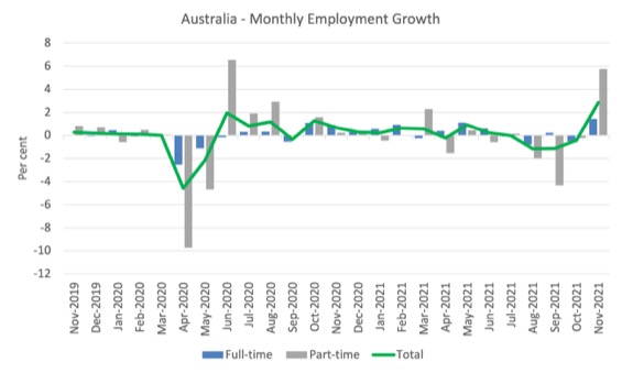
- Employment increased by 366,100 (2.9 per cent) – Full-time employment increased by 128,300 thousand and part-time employment increased by 237,800 thousand.
- Unemployment decreased by 69,400 to 636,700 persons.
- The official unemployment rate decreased 0.6 points to 4.6 per cent.
- The participation rate rose by 1.4 points to 66.1 per cent.
- The employment-population ratio increased by 1.8 points to 63 per cent.
- Aggregate monthly hours worked increased 77 million hours (4.5 per cent).
- Underemployment decreased by 2 points to 7.5 per cent (a fall of 252.1 thousand). Overall there are 1,032.9 thousand underemployed workers. The total labour underutilisation rate (unemployment plus underemployment) decreased by 2.6 points to 12.1 per cent. There were a total of 1,669.6 thousand workers either unemployed or underemployed.
In its – Media Release – the ABS note that:
The easing of restrictions in both New South Wales and Victoria had a large influence on the national figures, with employment in the two states increasing by 180,000 people and 141,000 people between October and November. Employment in those jurisdictions in November was only 52,000 people and 4,000 people below May, having fallen by 250,000 people and 145,000 people during the lockdowns.
So open up and jobs return as does the infection rate.
Employment increased by 366,100 in November 2021
1. Employment growth was 2.9 per cent with 366,100 (net) jobs being added.
2. Full-time employment increased by 128,300 thousand and part-time employment increased by 237,800 thousand.
3. Employment in Australia is 181.9 thousand (net) jobs (1.4 per cent) above the pre-pandemic level in February 2020.
The following graph shows the month by month growth in full-time (blue columns), part-time (grey columns) and total employment (green line) for the 24 months to November 2021 using seasonally adjusted data.
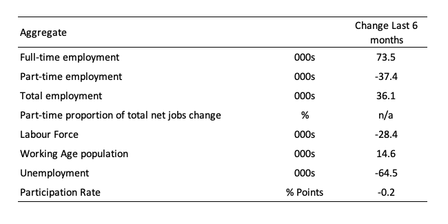
The following table provides an accounting summary of the labour market performance over the last six months to provide a longer perspective that cuts through the monthly variability and provides a better assessment of the trends.
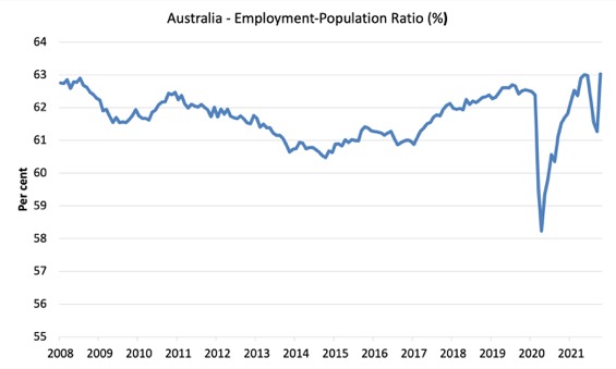
Given the variation in the labour force estimates, it is sometimes useful to examine the Employment-to-Population ratio (%) because the underlying population estimates (denominator) are less cyclical and subject to variation than the labour force estimates. This is an alternative measure of the robustness of activity to the unemployment rate, which is sensitive to those labour force swings.
The following graph shows the Employment-to-Population ratio, since February 2008 (the low-point unemployment rate of the last cycle).
It fell with the onset of the GFC, recovered under the boost provided by the fiscal stimulus packages but then went backwards again as the Federal government imposed fiscal austerity in a hare-brained attempt at achieving a fiscal surplus in 2012.
There are two forces working here – the denominator (population) is clearly providing favourable pressures due to the slower population growth as a result of the lack of immigration arising from the external border closures.
This is forcing employers to search harder for workers already in Australia rather than discriminate against the unemployed.
The numerator (employment) is clearly stronger as the restrictions ease.
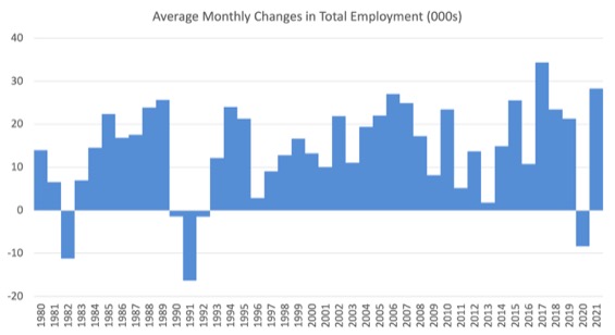
To put the current monthly performance into perspective, the following graph shows the average monthly employment change for the calendar years from 1980 to 2021 (to date).
1. The labour market weakened considerably over 2018 and that situation worsened in 2019.
2. The average employment change over 2020 was -8.4 thousand.
3. So far in 2021, the average monthly change is 28.3 thousand.
The following graph shows the average monthly changes in Full-time and Part-time employment (lower panel) in thousands since 1980.
The interesting result is that during recessions or slow-downs, it is full-time employment that takes the bulk of the adjustment. Even when full-time employment growth is negative, part-time employment usually continues to grow.
However, this crisis is different because much of the employment losses have been the result of lockdown and enforced business closures in sectors where part-time employment dominates.

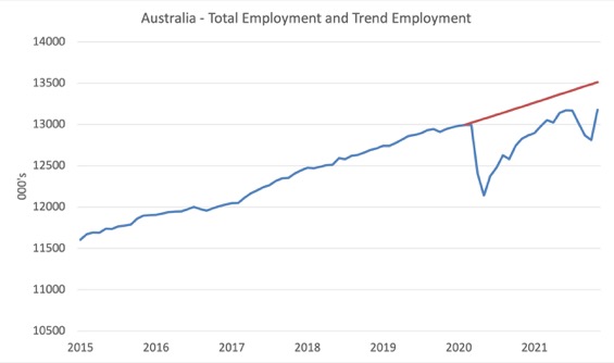
Actual and Trend Employment
The Australian labour market is now larger than it was in February 2020. But it is still a long way from where it would have been if it had have continued to expand at the previous trend.
The following graph shows total employment (blue line) and what employment would have been if it had continued to grow according to the average growth rate between 2015 and February 2020.
The gap as at November 2021 fell by 341.1 thousand to 335.3 thousand jobs.
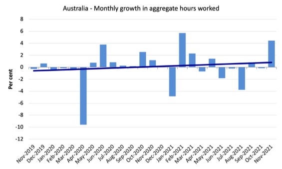
Hours worked increased 77 million hours (4.5 per cent) in November 2021
The following graph shows the monthly growth (in per cent) over the last 24 months.
The dark linear line is a simple regression trend of the monthly change.
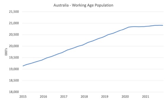
The Population Slowdown
The following graph shows Australia’s working age population (Over 15 year olds) from January 2015 to November 2021.
With the external border still largely closed, immigration has shrunk to virtually zero and the impact is very clear.
This flattening out has forced employers to work harder to get workers and is one of the reasons unemployment is falling quite quickly, given the circumstances.
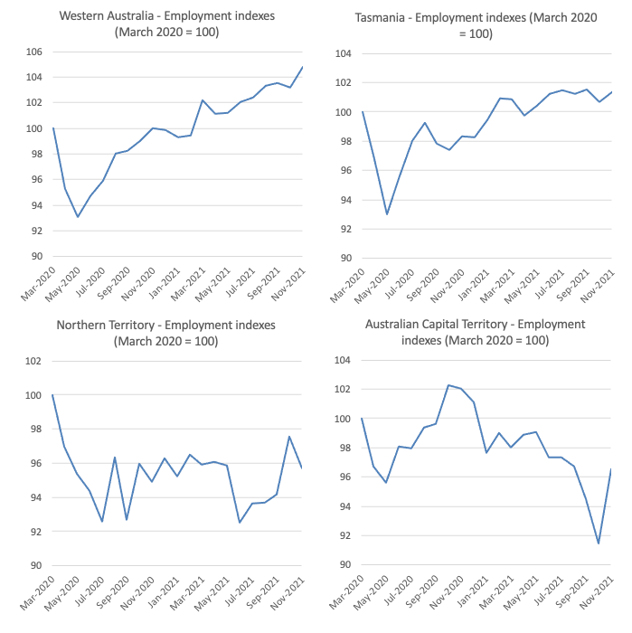
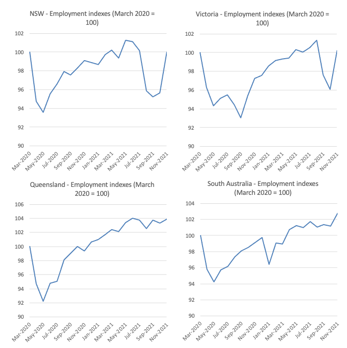
State by State Employment Trends
The lockdowns imposed in Sydney, Canberra and Melbourne are now over and the results are clear.
The following graphs show the employment evolution since March 2020 by state and territory.
NSW and Victoria are back to their March 2020 employment levels.
The ACT is 3.5 points below the March 2020 level.
WA is doing the best and will not open its borders until February 2022. They have chosen to have both stronger employment and zero infections.
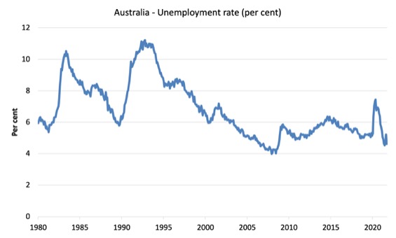
Unemployment decreased by 69,400 to 636,700 persons in November
The official unemployment rate decreased 0.6 points to 4.6 per cent which was driven by strong employment growth.
The following graph shows the national unemployment rate from February 1980 to November 2021. The longer time-series helps frame some perspective to what is happening at present.
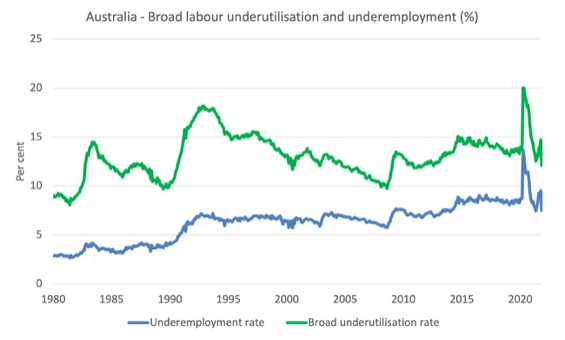
Broad labour underutilisation declined by 2.6 points to 12.1 per cent in November 2021
The results for November 2021 are (seasonally adjusted):
1. Underemployment decreased by 2 points to 7.5 per cent (a fall of 252.1 thousand).
2. Overall there are 1,032.9 thousand underemployed workers.
3. The total labour underutilisation rate (unemployment plus underemployment) decreased by 2.6 points to 12.1 per cent.
4. There were a total of 1,669.6 thousand workers either unemployed or underemployed.
The following graph plots the seasonally-adjusted underemployment rate in Australia from February 1980 to the November 2021 (blue line) and the broad underutilisation rate over the same period (green line).
The difference between the two lines is the unemployment rate.
The three cyclical peaks correspond to the 1982, 1991 recessions and the more recent downturn.
The other difference between now and the two earlier cycles is that the recovery triggered by the fiscal stimulus in 2008-09 did not persist and as soon as the ‘fiscal surplus’ fetish kicked in in 2012, things went backwards very quickly.
The two earlier peaks were sharp but steadily declined. The last peak fell away on the back of the stimulus but turned again when the stimulus was withdrawn.
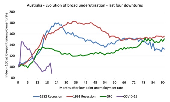
Unemployment and broad labour underutilisation indexes – last four downturns
The following graph captures the evolution of the unemployment rates for the 1982, 1991, GFC and COVID-19 downturns.
For each episode, the graph begins at 100 – which is the index value of the unemployment rate at the low-point of each cycle (June 1981; December 1989; February 2008, and February 2020, respectively).
We then plot each episode out for 90 months.
For 1991, the peak unemployment which was achieved some 38 months after the downturn began and the resulting recovery was painfully slow. While the 1982 recession was severe the economy and the labour market was recovering by the 26th month. The pace of recovery for the 1982 once it began was faster than the recovery in the current period.
During the GFC crisis, the unemployment rate peaked after 16 months (thanks to a substantial fiscal stimulus) but then started rising again once the stimulus was prematurely withdrawn and a new peak occurred at the 80th month.
The COVID-19 downturn was obviously worse than any of the previous recessions shown but because of its unique nature – the job losses being largely driven by lockdowns etc.
The graph provides a graphical depiction of the speed at which each recession unfolded (which tells you something about each episode) and the length of time that the labour market deteriorated (expressed in terms of the unemployment rate).
After 21 months, the unemployment had risen from 100 to:
1. 185.2 index points in 1982 and rising.
2. 171.6 index points in 1991 and rising.
3. 139.6 index points in the GFC and falling.
4. 89.8 index points currently and falling.
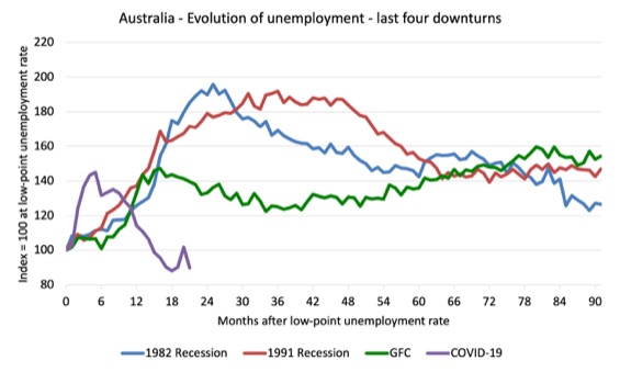
Note that these are index numbers and only tell us about the speed of decay rather than levels of unemployment.
The next graph performs the same operation for the broad labour underutilisation rate (sum of official unemployment and underemployment).
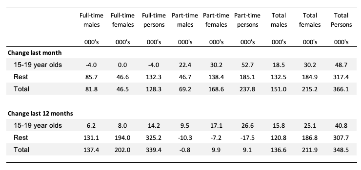
Teenage labour market continues to improve in November 2021
The following Table shows the distribution of net employment creation in the last month and the last 12 months by full-time/part-time status and age/gender category (15-19 year olds and the rest).
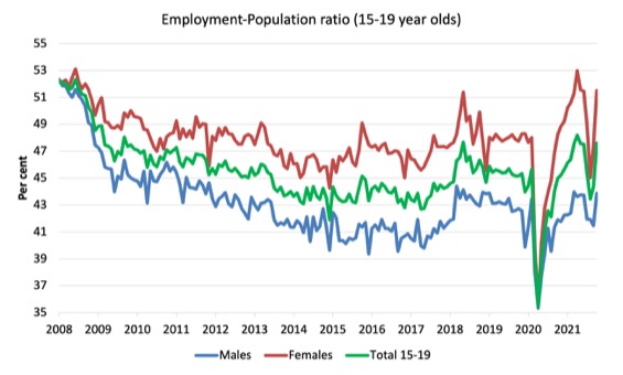
To put the teenage employment situation in a scale context (relative to their size in the population) the following graph shows the Employment-Population ratios for males, females and total 15-19 year olds since June 2008.
You can interpret this graph as depicting the loss of employment relative to the underlying population of each cohort. We would expect (at least) that this ratio should be constant if not rising somewhat (depending on school participation rates).
1. The male ratio has fallen by 8.5 percentage points since February 2008, and rose by 2.4 points in November. It is now 0.4 points above its level in March 2020.
2. The female ratio has fallen by 0.6 percentage points since February 2008, and in in November it rose by 4.1 points. It is now 3.5 points above its level in March 2020.
3. The overall teenage employment-population ratio has fallen by 4.6 percentage points since February 2008, is now 1.9 points above its level in March 2020. It rose by 3.2 points over the month.
Conclusion
My standard monthly warning: we always have to be careful interpreting month to month movements given the way the Labour Force Survey is constructed and implemented.
My overall assessment is:
1. The cessation of most Covid restrictions has allowed the labour market to bounce back fairly strongly.
2. There are still 1.6 million Australian workers without work in one way or another (officially unemployed or underemployed) and several hundred thousand who have left the active labour force due to lack of employment opportunities.
3. Overall, the labour market is in better shape than it was during the lockdowns byt more can be doine to drive down the labour underutilisation rate.
That is enough for today!
(c) Copyright 2021 William Mitchell. All Rights Reserved.
BoE raised interest rates, interesting to see if this will be the new trend or just a short lived raise to fend off criticism. With Rishi’s statements yesterday and how Omnicron is spreading here in London with authorities giving mixed messages I am not too hopeful of where our recovery is going…
Hello bill,I have been reading your work and enjoying it . Can you investigate Turkey ? I am from Turkey and the case is somewhat similar to 2000’s Argentina, prior hardcore corruption accompanied by high yields, somewhat high external debt, low competition here are some major shifts happening currently ,Leaders started to target on low income, they repel external debt from IMF, constantly lowering yields, increase minimum wage and act on flexing banks capital requirements, targeting stores who stock out goods and increase prices as they like but at the mean time some strange things happening such they release foreign reserves (they have too little) to reduce short-term volatility in currency.Opposition is currently alarming the crowd and people do not believe Erdogan anymore.I believe it is the best case to target a labour crisis however,I think it happened so fast without taking one step at a time. I am willing to help if you want to know further.