Today (April 18, 2024), the Australian Bureau of Statistics released the latest - Labour Force,…
US labour market – employment and participation up, but still no obvious wage pressures
Last Friday (February 4, 2022), the US Bureau of Labor Statistics (BLS) released their latest labour market data – Employment Situation Summary – January 2022 – which reported a total payroll employment rise of only 467,000 jobs in December and a rise in the participation rate – which often leads to a rise in the unemployment rate as marginal workers outside the labour force sense their opportunities for work are now better. Employment growth accelerated in January 2022 which reverses the recent trend. 0.3 points decline in the official unemployment rate to 3.9 per cent, while participation was unchanged at 61.9 per cent. While the US labour market is still creating work – it is doing so at a declining rate and there are unequal patterns across the industrial sectors. The US labour market is still 2,875 thousand jobs short from where it was at the end of February 2020, which helps to explain why there are no fundamental wage pressures emerging. Any analyst who is claiming the US economy is close to full employment hasn’t looked at the data.
Overview for January 2022:
- Payroll employment increased by 467,000.
- Total labour force survey employment rose by 1,199 thousand net (0.77 per cent).
- The seasonally adjusted labour force 1,393 thousand net (0.86 per cent).
- The employment-population ratio rose 0.2 points to 59.7 per cent (down from February 2020 peak of 61.1 per cent).
- Official unemployment rose by 194 thousand to 6,513 thousand.
- The official unemployment rate rose by 0.1 points to 4 per cent.
- The participation rate rose by 0.3 points to 62.2 per cent.
- The broad labour underutilisation measure (U6) fell by 0.2 points to 7.1 per cent.
For those who are confused about the difference between the payroll (establishment) data and the household survey data you should read this blog post – US labour market is in a deplorable state – where I explain the differences in detail.
Some months the difference is small, while other months, the difference is larger.
Summary Reflections
The US labour market was much stronger in January 2022 with participation rates rising along with robust employment growth.
When that combination occurs, unemployment initially rises, which as more people, who were out of the labour force, sense they can secure work. This is the process that brings marginal workers back into productive work.
The wage trends are still not indicating that there is a blow-out occurring. The relationship between wages growth and employment growth is not straightforward (see below).
I still think that there is no case for the US Federal Reserve to increase interest rates nor for there to be any serious fiscal constraction contemplated.
The cost pressures are still coming predominantly from supply constraints and all a policy tightening will do is damage employment growth.
When inflationary pressures are driven by the supply side as they are now – cartel behaviour (oil), and production and delivery issues (Covid) increasing interest rates and cutting spending will not only not reduce the price pressures but will damage the gains in unemployment reductions.
It is obvious that the real wage in the US is still in decline. Again no time for policy austerity.
Policy makers just need to ride out this transitory rise in prices, which will endure until the constraints arising from the pandemic sort themselves out.
Payroll employment trends
The BLS noted that:
Total nonfarm payroll employment increased by 467,000 in January, compared with an average monthly gain of 555,000 in 2021. Nonfarm employment has increased by 19.1 million since April 2020 but is down by 2.9 million, or 1.9 percent, from its pre-pandemic level in February 2020 …
Employment in leisure and hospitality expanded by 151,000 in January … Since February 2020, employment in leisure and hospitality is down by 1.8
million, or 10.3 percent.In January, professional and business services added 86,000 jobs … is 511,000 higher than in February 2020 …
Retail trade employment rose by 61,000 in January … is 61,000 above its level in February 2020.
Employment in transportation and warehousing increased by 54,000 in January and is 542,000 higher than in February 2020.
Employment in local government education rose by 29,000 in January but is down by 359,000, or 4.4 percent, since February 2020.
Employment in health care continued to trend up (+18,000) over the month but is down by 378,000, or 2.3 percent, from its level in February 2020.
Wholesale trade added 16,000 jobs in January … is 125,000, or 2.1 percent, lower than in February 2020.
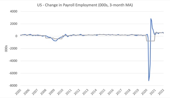
The first graph shows the monthly change in payroll employment (in thousands, expressed as a 3-month moving average to take out the monthly noise). The gray lines are the annual averages.
The data swings are still large and dwarf the past history.
The US labour market is still 2,875 thousand jobs short from where it was at the end of February 2020 and the commentary from the BLS above tells us how this shortfall is distributed across the sectors.
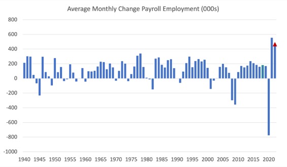
The next graph shows the same data in a different way – in this case the graph shows the average net monthly change in payroll employment (actual) for the calendar years from 2005 to 2021.
The red marker on the column is the current month’s result.
The final average for 2019 was 168 thousand.
The final average for 2020 was -785 thousand.
The final average for 2021 was 555 thousand.
The average so far in 2022 is 467 thousand.
Labour Force Survey – employment growth accelerates as does participation
The data for January 2022 reveals:
1. Total labour force survey employment rose by 1,199 thousand net (0.77 per cent).
2. The seasonally adjusted labour force 1,393 thousand net (0.86 per cent).
3. The participation rate rose by 0.3 points to 62.2 per cent.
4. As a result (in accounting terms), total measured unemployment rose by 194 thousand to 6,513 thousand and the unemployment rate rose by 0.1 points to 4 per cent.
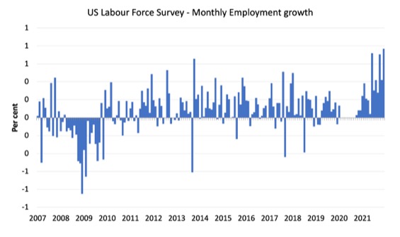
The following graph shows the monthly employment growth since January 2008 and excludes the extreme observations (outliers) between March 2020 and October 2020, which distort the current period relative to the pre-pandemic period.
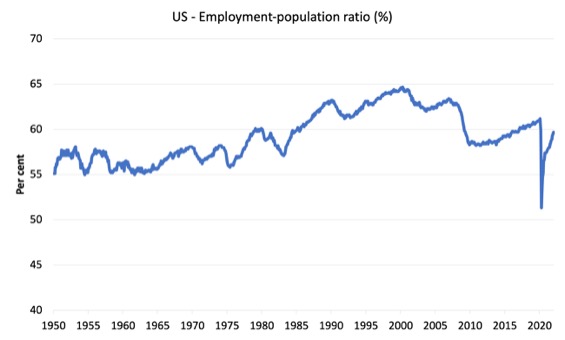
The Employment-Population ratio is a good measure of the strength of the labour market because the movements are relatively unambiguous because the denominator population is not particularly sensitive to the cycle (unlike the labour force).
The following graph shows the US Employment-Population from January 1950 to January 2022.
While the ratio fluctuates a little, the April 2020 ratio fell by 8.6 points to 51.3 per cent, which is the largest monthly fall since the sample began in January 1948.
In January 2022, the ratio rose by 0.2 points to 59.7 per cent.
It is still well down on the level in February 2020 (61.1 per cent).
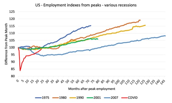
As a matter of history, the following graph shows employment indexes for the US (from US Bureau of Labor Statistics data) for the five NBER recessions since the mid-1970s and the current 2020-COVID crisis.
They are indexed at the employment peak in each case and we trace the data out for each episode until one month before the next peak.
So you get an idea of:
1. The amplitude (depth) of each cycle in employment terms.
2. The length of the cycle in months from peak-trough-peak.
The early 1980s recession was in two parts – a short downturn in 1981, which was followed by a second major downturn 12 months later in July 1982 which then endured.
Other facts:
1. Return to peak for the GFC was after 78 months.
2. The previous recessions have returned to the 100 index value after around 30 to 34 months.
3. Even at the end of the GFC cycle (146 months), total employment in the US had still only risen by 8.3 per cent (since December 2007), which is a very moderate growth path as is shown in the graph.
The COVID collapse was something else but the recent gains are evident, although the gains have been slowing relative to early in the recovery.
After 23 months, total employment is still 1.1 points below the February 2020 level.
Unemployment and underutilisation trends
The BLS note that:
Both the unemployment rate, at 4.0 percent, and the number of unemployed persons, at 6.5 million, changed little in January. Over the year, the unemployment rate is down by 2.4 percentage points, and the number of unemployed persons declined by 3.7 million. In February 2020, prior to the coronavirus (COVID-19) pandemic, the unemployment rate was 3.5 percent, and unemployed persons numbered 5.7 million. …
The number of long-term unemployed (those jobless for 27 weeks or more) declined by 185,000 to 2.0 million in December. This measure is down from 4.0 million a year earlier but is 887,000 higher than in February 2020. The long-term unemployed accounted for 31.7 percent of the total unemployed in December.
Unemployment rose even though employment growth was robust because participation rose with more people coming in looking for work.
That is what happens when labour market conditions are imporoving.
The first graph shows the official unemployment rate since January 1994.
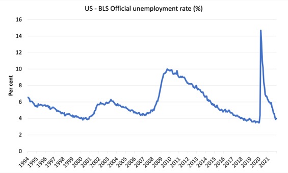
The official unemployment rate is a narrow measure of labour wastage, which means that a strict comparison with the 1960s, for example, in terms of how tight the labour market, has to take into account broader measures of labour underutilisation.
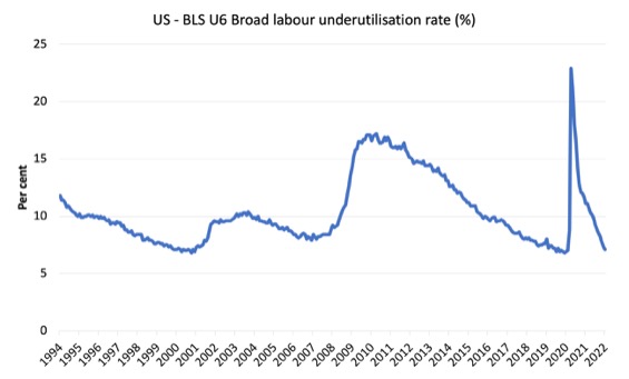
The next graph shows the BLS measure U6, which is defined as:
Total unemployed, plus all marginally attached workers plus total employed part time for economic reasons, as a percent of all civilian labor force plus all marginally attached workers.
It is thus the broadest quantitative measure of labour underutilisation that the BLS publish.
Pre-COVID, U6 was at 6.8 per cent (December 2019).
In January 2022 the U6 measure was 7.1 per cent, a decline of 0.2 points on the previous month.
Most of this fall was due to the decline in the workers in the ‘part-time for economic reasons’ cohort (the US indicator of underemployment).
Ethnicity and Education
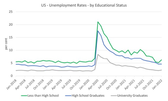
The next graph shows the evolution of unemployment rates for three cohorts based on educational attainment: (a) those with less than high school completion; (b) high school graduates; and (c) university graduates.
As usual, when there is a crisis, the least educated suffer disproportionately.
In the collapse in employment, the unemployment rates rose by:
- 14.2 points for those with less than high-school diploma.
- 13.2 points for high school, no college graduates.
- 5.9 points for those with university degrees.
The period since April 2020 has seen the unemployment rate fall by:
- 14.8 points for those with less than high-school diploma meaning the unemployment rate is now 1.7 points below the March 2020 level.
- 13 points for high school, no college graduates meaning the unemployment rate is now 0.2 points above the March 2020 level.
- 6.1 points for those with university degrees meaning the unemployment rate is now 0.4 points below the March 2020 level.
In the last month, the change in the unemployment rate has been:
- a rise of 1.1 points for those with less than high-school diploma.
- No change for high school, no college graduates.
- a rise of 0.2 points for those with university degrees.
 0
0
In the US context, the trends in trends in unemployment by ethnicity are interesting.
Two questions arise:
1. How have the Black and African American and White unemployment rate fared in the post-GFC period?
2. How has the relationship between the Black and African American unemployment rate and the White unemployment rate changed since the GFC?
Summary:
1. All the series move together as economic activity cycles. The data also moves around a lot on a monthly basis.
2. The Black and African American unemployment rate was 6.8 per cent in March 2020, rose to 16.6 per cent in May and is at 6.9 per cent in January 2022. In the last month, it was fell by 0.2 points, which runs counter the trend.
3. The Hispanic or Latino unemployment rate was 6 per cent in March 2020, rose to 18.9 per cent in April and is at 4.9 per cent in January 2022. In the last month, it was unchanged.
4. The White unemployment rate was 3.9 per cent in March 2020, rose to 14.1 per cent in April and rose to 3.4 per cent in January 2022. In the last month, it rose by 0.2 points.
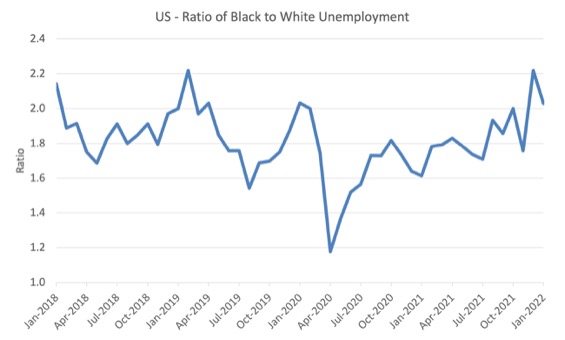
The next graph shows the Black and African American unemployment rate to White unemployment rate (ratio) from January 2018, when the White unemployment rate was at 3.5 per cent and the Black or African American rate was at 7.5 per cent.
This graph allows us to see whether the relative position of the two cohorts has changed since the crisis.
If it is rising, then the unemployment rate of the Black and African American cohort is either rising faster than the white unemployment rate or falling more slowly (or a combination of that relativity).
While there is month-to-month variability, the data shows that, in fact, through to mid-2019, the position of Black and African Americans had improved in relative terms (to Whites), although that just reflected the fact that the White unemployment was so low that employers were forced to take on other ‘less preferred’ workers if they wanted to maintain growth.
In April 2019, the ratio was 2.1 (meaning the Black and African American unemployment rate was more than 2 times the White rate).
By April 2020, the ratio had fallen to its lowest level of 1.2, reflecting the improved relative Black and African American position.
As the pandemic hit, the ratio rose and peaked at 1.8 in October 2020.
In January 2022, the ratio was 2.03, a fal of 0.2 points from the previous month, which indicates that the relative position of the Black and African American cohort has improved quite significantly.
This is the result of a combination of a rise in the white unemployment rate and a fall in the black rate.
Special analysis this month – Occupational employment and earnings growth
Inflation mania is loose now and the economic media is running stories about a return to the 1970s.
Two things happened in that decade relevant to the issue: (a) trade unions were able to push wages up very quickly; (b) OPEC was able to push up oil prices dramatically.
The second is happening at present.
But the first?
Is there any evidence that wages growth was breaking out, which might propagate an inflationary spiral on the back of the supply-side pressures at the moment?
I decided to update my understanding of what is happening at the occupational level, given we now have data for the fourth-quarter 2022. There is detailed data for full-time, wage and salary earners.
Using this data, we find considerable the diversity in outcomes both within the occupational categories (the sub-aggregates) and between the categories.
Note that:
1. Management, professional and related occupations encompasesses Management, business, and financial operations occupations and Professional and related occupations.
2. Sales and office occupations encompasses Sales and related occupations and Office and administrative support occupations.
3. Natural resources, construction, and maintenance occupations encompasses Farming, fishing, and forestry occupations and Construction and extraction occupations and Installation, maintenance, and repair occupations
4. Production, transportation, and material moving occupations encompasses Production occupations and Transportation and material moving occupations.
Within each of these aggregates there is occupational diversity in terms of median weekly earnings.
For example, within aggregate (3), the Farming, fishing, and forestry occupations are classified as low-pay, while the Installation, maintenance, and repair occupations are above-average.
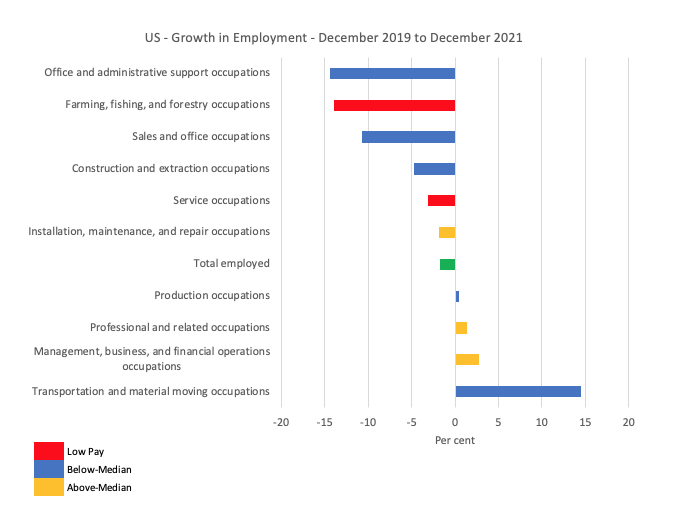
The first graph shows the growth in employment between December 2019 and December 2021 by the sub-occupational categories.
The colour codes denote above-median (gold), below-median (blue) and within the latter category, low-pay (red), which is below 75 per cent of the Median weekly earnings. The green bar is the Economy-wide median weekly earnings.
Overall, as at December 2021, the labour market is still 2,015 thousand full-time, wage and salary earner jobs short of where it was in December 2019 (down 1.7 per cent).
Clearly, some occupations have fared well over this period in terms of employment growth (for example, Transporation and material moving occupations have grown by 14.5 per cent), while others have endured devastating employment losses.
Overall the employment losses have been concentrated at the low-pay end of the labour market.
1. Above-Median earnings – gained 928 thousand (net) jobs.
2. Below-Median earnings – lost 2,311 thousand (net) jobs.
3. Low-pay – lost 632 thousand (net) jobs (27.3 per cent of the Below-Median job losses).
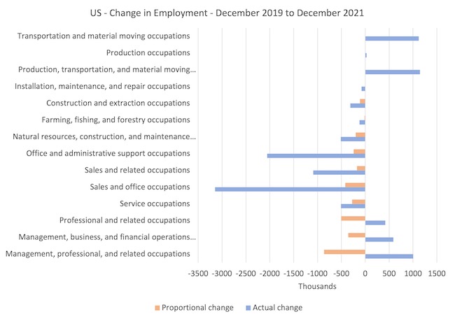
The next graph captures how the occupational composition of the labour market has shifted during the pandemic to date.
It helps us to understand relative scales (importance of each occupational category in total jobs)
The blue bars show the actual employment change for each occupational category between December 2019 and September 2021, while the orange bars show what the employment change would have been if the categories had have shared in the total employment loss over this period according to their December 2019 shares in total employment.
The difference between the bars tells you the extent to which their has been a shift in the composition.
The real issue relates to the relative damage done to the low-pay service workers and the gains made by the high-paid workers in management, business and financial occupations.
The other lower occupational groups at the lower-end of the Below-Median group also lost more jobs that their 2019 shares would have indicated.
The next graph shows the growth in nominal and real Median weekly earnings between December 2019 and December 2021 for the occupational categories.
Overall, there was a 7.9 per cent growth in nominal Median weekly earnings over this period and a reduction in real earnings by 0.6 per cent, although there has been considerable diversity across the occupational distribution with no clear pattern.
The CPI grew by 8.5 per cent over the period.
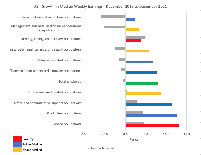
If we compare the two series (employment and earnings) the situation is far from straightforward.
For example, even though the ‘Transportation and Material Moving’ workers have done very well in terms of full-time employmen growth, they have not translated that into real wages growth, whereas the ‘Sales and Service occupations’ (generally) have lost jobs but secured strong real wages growth.
I will recalculated these trends for the last few months only when I do this analysis again.
It is clear that overall, real wages are falling.
And where they are not, there is no clear indication of the strength of employment driving the outcome.
More time is needed to understand all of this.
But I cannot yet see the consistent emergence of the propagating mechanisms that will turn the supply shocks into a persistent wage-price spiral (like what happened in the 1970s).
Conclusion
The US labour market was much stronger in January 2022 with participation rates rising along with robust employment growth.
The US labour market is still 2,875 thousand jobs short from where it was at the end of February 2020.
The employment-population ratio is still well down on the February 2020 peak.
Taken together, there are no fundamental wage pressures emerging at present despite the spikes in inflation arising from supply chain constraints.
That is enough for today!
(c) Copyright 2022 William Mitchell. All Rights Reserved.
Hi Bill,
Once again, I enjoy your blog. Agree that there is ample slack in the US labour market, but can’t reach your conclusion on (nominal) wage pressures. In the 3mth to the end of Jan, ave hourly earning grew by an saar of 6.9% and by 5.7% from a year ago. The saar has been rising since April last year. It’s a clear trend by any reasonable definition
Good thing is (in my view) that it’s being driven by the lower paid cohorts. Look at Average Hourly Earnings of Production and Nonsupervisory Employees and you’ll see it’s up 6.9% from a year ago and over the last 3mth up by 7.8% saar. No, it’s not a blow out and it may well be temporary, but the upward trend is clear (and a good thing).
Many causes for this, including disincentivisation by layered federal and state benefit schemes that were in place past their best before date. States that removed the additional benefits showed faster increases in workforce participation. It’s entirely possible new Covid waves will hit, in which case these payments should be immediately reinstated.
Cheers.