Today (March 6, 2024), the Australian Bureau of Statistics released the latest - Australian National…
Australian national accounts – growth rebound
Today (March 2, 2022), the Australian Bureau of Statistics released the latest – Australian National Accounts: National Income, Expenditure and Product, December 2021 – which shows that the Australian economy reversed the contraction in the September-quarter 2021 and posted an annual growth rate of 4.2 per cent. Covid lockdowns and restrictions caused the contraction and their abandonment allowed for growth to return. Growth was driven by strong growth in household consumption expenditure as public fiscal support declined and private investment expenditure went backwards. The change in the terms of trade was negative reflecting the rising import prices as supply constraints continue and demand rises. Overall, a good result but the next quarter will be much less robust (floods etc).
The main features of the National Accounts release for the December_quarter 2021 were (seasonally adjusted):
- Real GDP increased by 3.2 per cent for the quarter. The annual growth rate was 4.2 per cent
- Australia’s Terms of Trade (seasonally adjusted) fell by 5.1 per cent in the quarter (a significant drop on previous quarters) but was up by 10.2 per cent over the 12 month period. This was the largest decline since the June-quarter 2009 and was due to the rising import prices (energy, etc).
- Real net national disposable income, which is a broader measure of change in national economic well-being rose by 1.7 per cent for the quarter and 3.7 per cent over the 12 months, which means that Australians are better off (on average) than they were at that point 12 months ago.
- The Household saving ratio (from disposable income) fell to 13.6 per cent (from 19.8 per cent) but remained higher than the pre-Covid ratio of 11.8 per cent).
The ABS released this new feature – The Australian Economy: 12 things you need to know about the December quarter 2021 – which is a succinct and useful summary for those who have limited time.
Overall growth picture – the Winter lockdown ended and growth returned
The ABS – Media Release – said that:
Australian Gross Domestic Product (GDP) rose 3.4 per cent in seasonally adjusted chain volume terms in the December quarter 2021 …
Private demand contributed 3.0 percentage points to GDP, with a 6.3 per cent rise in household final consumption expenditure. Household spending on both goods and services …
Domestic demand drove the growth this quarter, with high levels of household spending, particularly in the states that emerged from COVID-19 lockdowns …
Net trade detracted 0.2 percentage points from GDP this quarter …
The fall in household saving was driven by increased household spending, coupled with a decline in household income. Household gross disposable income fell 0.5 per cent with the reduction of government support payments to households and unincorporated businesses affected by COVID-19.
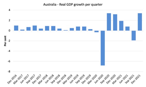
The first graph shows the quarterly growth over the last five years.
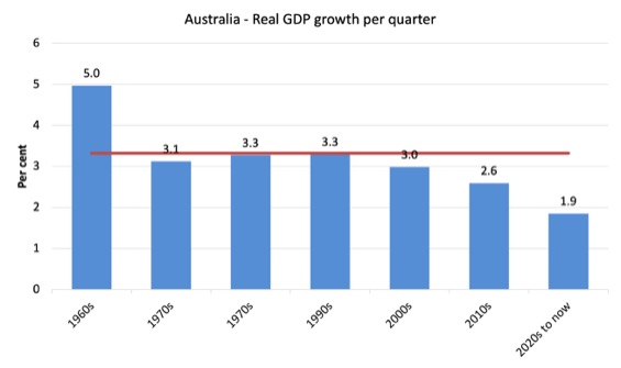
To put this into historical context, the next graph shows the decade average annual real GDP growth rate since the 1960s (the horizontal red line is the average for the entire period (3.3 per cent) from the March-quarter 1960 to the December-quarter 2021).
The 2020-to-now average is obviously is the average for the first 8 quarters of this decade and has been dominated by the pandemic.
It is obvious then how far below historical trends the growth performance of the last 2 decades have been as the fiscal surplus obsession has intensified on both sides of politics.
Even with a massive household credit binge and a once-in-a-hundred-years mining boom that was pushed by stratospheric movements in our terms of trade, our real GDP growth has declined substantially below the long-term performance.
The 1960s was the last decade where were pursued and maintained true full employment.
Analysis of Expenditure Components
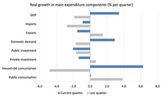
The following graph shows the quarterly percentage growth for the major expenditure components in real terms for the September-quarter 2021 (grey bars) and the December-quarter 2021 (blue bars).
Points to note:
1. Household Consumption expenditure rose by 6.3 per cent in the December-quarter. It exceeded the pre-pandemic level for the first time in the December-quarter 2022.
2. General government consumption expenditure was flat in the December_quarter but had grown by 5.1 per cent over the 12 months. The fiscal support is now waning but with the massive floods Australia is now enduring, the federal expenditure will have to rise in the March-quarter 2022.
3. Private investment expenditure growth fell by 1.4 per cent for the quarter but had risen by 7.4 per cent over the year.
4. Public investment fell 2.2 per cent for the quarter but was up by 5.4 per cent for the year, as a result of some very large state-level infrastructure projects.
5. Export expenditure fell by 1.5 per cent for the quarter and 2.6 per cent over the 12 months. Imports fell again, this quarter by 0.9 per cent but were still 1 per cent higher over the year.
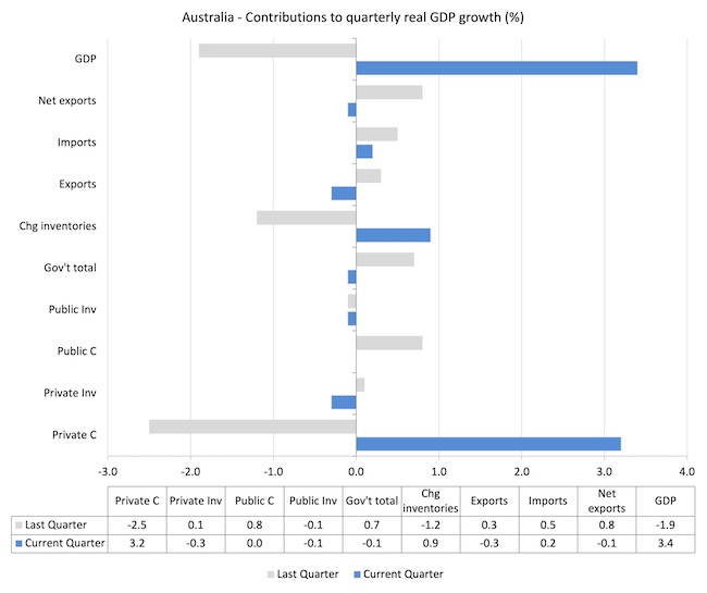
Contributions to growth
What components of expenditure added to and subtracted from the 3.4 per cent rise in real GDP growth in the December-quarter 2022?
The following bar graph shows the contributions to real GDP growth (in percentage points) for the main expenditure categories. It compares the December-quarter 2021 contributions (blue bars) with the September-quarter 2021 (gray bars).
In no order:
1. Household consumption expenditure added 3.2 points to the overall growth rate of 3.4 per cent.
2. Public Investment reduced growth by 0.1 points.
3. Growth in inventories contributed 0.9 points to growth as firms built up previously depleted stock levels.
4. Private investment expenditure reduced growth by 0.3 points – the second month of slowdown.
5. Public consumption contributed nothing as fiscal support was withdrawn. Overall, the government sector dragged on growth by 0.1 points.
5. Net exports reduced growth by 0.1 points with both a decline in exports (-0.1 points drag) and a fall in imports (0.2 points) at work (remember imports are a drain on expenditure).
Material living standards rose in December-quarter 2021
The ABS tell us that:
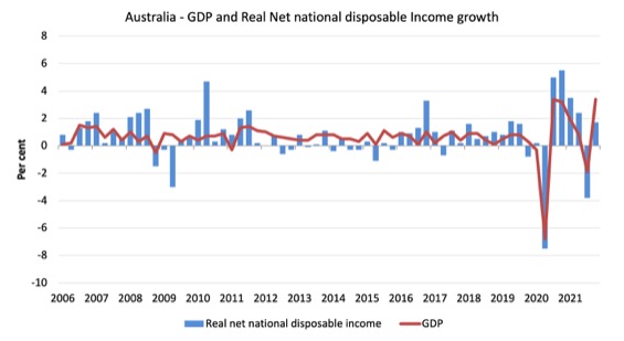
A broader measure of change in national economic well-being is Real net national disposable income. This measure adjusts the volume measure of GDP for the Terms of trade effect, Real net incomes from overseas and Consumption of fixed capital.
While real GDP growth (that is, total output produced in volume terms) rose by 3.4 per cent in the December-quarter 2021, real net national disposable income growth rose by 1.7 per cent.
How do we explain that?
Mostly because while GDP growth was positive, the terms of trade fell (as import prices rose) and household disposable income fell by 0.5 per cent as a result of the decline in government support payments as the lockdowns ended.
The following graph shows the evolution of the quarterly growth rates for the two series since the March-quarter 2006.
Household saving ratio fell by 6.2 points to 13.6 per cent
The combination of the fall in Gross disposable income as government support payments declined and the opening up of spending opportunities as a result of the relaxation of the extensive restrictions in NSW, ACT and Victoria meant that the saving ratio fell back to 13.6 per cent.
The following graph shows the household saving ratio (% of disposable income) from the March-quarter 2000 to the current period. It shows the period leading up to the GFC, where the credit binge was in full swing and the saving ratio was negative to the rise during the GFC and then the most recent rise.
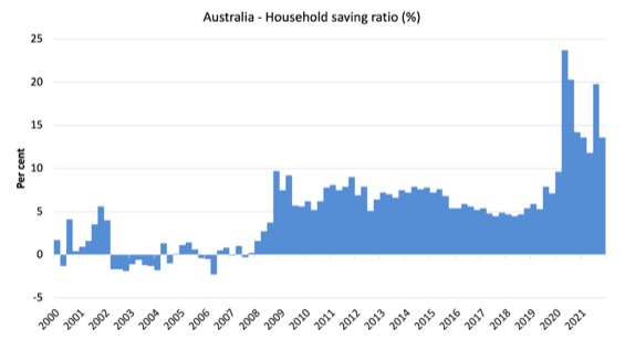
While the saving ratio might appear to be still very high, if we take a longer term view of it, the behaviour is less ‘historic’ than we might think.
The next graph shows the household saving ratio (% of disposable income) from the March-quarter 1960 to the current period.
Back in the full employment days, when governments supported the economy and jobs with continuous fiscal deficits (mostly), households saved significant proportions of their income.
In the neoliberal period, as credit has been rammed down their throats, the saving rate dropped (to negative levels in the lead-up to the GFC).
Hopefully, households are paying off the record levels of debt they are now carrying and improving their financial viability.
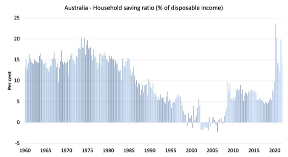
The following table shows the impact of the neoliberal era on household saving. These patterns are replicated around the world and expose our economies to the threat of financial crises much more than in pre-neoliberal decades.
The result for the current decade (2020-) is the average from March 2020.
| Decade | Average Household Saving Ratio (% of disposable income) |
| 1960s | 14.4 |
| 1970s | 16.2 |
| 1980s | 12.0 |
| 1990s | 5.1 |
| 2000s | 1.4 |
| 2010s | 6.4 |
| 2020- | 15.8 |
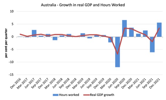
Real GDP growth and hours worked both improve
The following graph presents quarterly growth rates in real GDP and hours worked using the National Accounts data for the last five years to the December-quarter 2021.
The data shows that both output and hours worked rose during the December-quarter 2021.
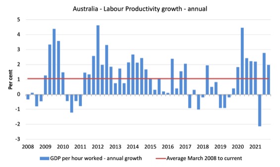
To see the above graph from a different perspective, the next graph shows the annual growth in GDP per hour worked (labour productivity) from the March-quarter 2008 quarter to the December-quarter 2021. The horizontal red line is the average annual growth since March-quarter 2008 (1.1 per cent), which itself is an understated measure of the long-term trend growth of around 1.5 per cent per annum.
The relatively strong growth in labour productivity in 2012 and the mostly above average growth in 2013 and 2014 helps explain why employment growth was lagging given the real GDP growth. Growth in labour productivity means that for each output level less labour is required.
As a result of output rising faster than hours worked, overall productivity rose.
The distribution of national income – slight gain in wage share
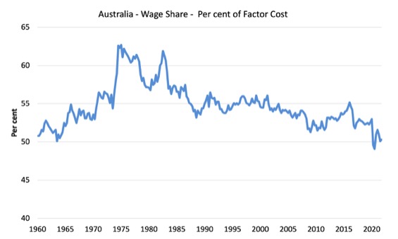
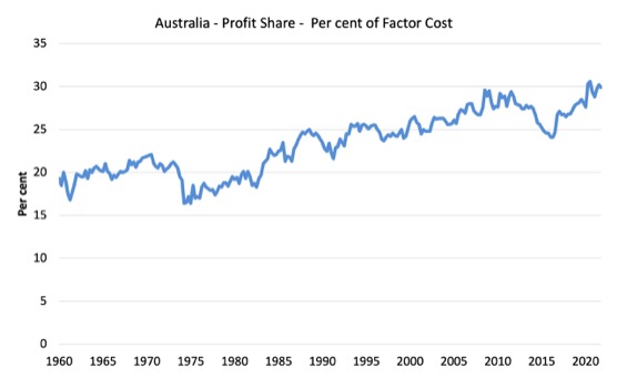
The wage share in national income rose by 0.2 points to 50.3 per cent while the profit share fell by 0.3 points. The terms of trade decline meant that the domestic sector overall had less share.
The first graph shows the wage share in national income while the second shows the profit share.
The declining share of wages historically is a product of neoliberalism and will ultimately have to be reversed if Australia is to enjoy sustainable rises in standards of living without record levels of household debt being relied on for consumption growth.
 \
\
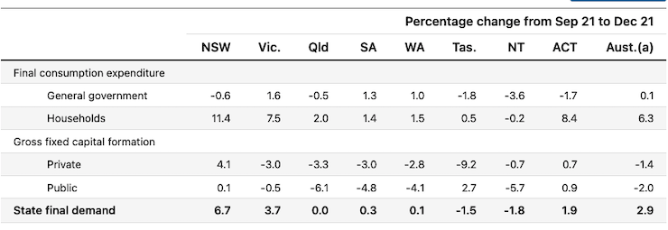
The change in final demand at the State/Territory level
The following table (taken from the ABS – thanks) shows the states/territories final demand trends for the December_quarter 2021.
The three lockdown states/territories – NSW, Victoria and ACT – all rebounded as the restrictions were relaxed.
Conclusion
Remember that the National Accounts data is three months old – a rear-vision view – of what has passed and to use it to predict future trends is not straightforward.
The data tells us that the economy rebounded after the lockdowns ended and restrictions were relaxed.
I wrote last quarter that I expected that there would be a relatively strong result in the December-quarter and the data has verified that expectation.
Growth was driven by strong growth in household consumption expenditure as public fiscal support declined and private investment expenditure went backwards.
The change in the terms of trade was negative reflecting the rising import prices as supply constraints continue and demand rises.
Overall, a good result but the next quarter will be much less robust (floods etc).
That is enough for today!
(c) Copyright 2021 William Mitchell. All Rights Reserved.
Please could you explain how this article relates to MMT? Is this the economic model that the current government is using?
I’m no expert.
Bill thinks that he needs to comment on the Aust. and US labor markets when their Gov. post labor reports.
It has little to do with MMT, except if he comments about MMT would do better.