Today (April 18, 2024), the Australian Bureau of Statistics released the latest - Labour Force,…
US Labour Market – creating work but participation and real wages falling
Last Friday (August 5, 2022), the US Bureau of Labor Statistics (BLS) released their latest labour market data – Employment Situation Summary – July 2022 – which reported a total payroll employment rise of only 528,000 jobs and an official unemployment rate of 3.5 per cent. Many commentators immediately claimed that the labour market was tightening as a result of the decline in the official unemployment rate, but that was all down to a decline in the participation rate – less people looking for work – which is a sure sign that job opportunities are becoming harder to access. When the hires data comes out soon, we will be able to be more definitive on that. The other interesting aspect of this data is that real wages continued to decline in all industry sectors – they have systematically fallen each month since March 2022. I note some commentators are trying to claim that wage pressures are now pushing inflation. That conclusion is untenable given the data. The US labour market is still producing employment but it is hardly booming.
Overview for July 2022:
- Payroll employment increased by 528,000.
- Total labour force survey employment rose by 179 thousand net (0.11 per cent).
- The seasonally adjusted labour force fell by 63 thousand net (-0.04 per cent).
- The employment-population ratio rose by 0.1 points to 60 per cent on the back of a slowing working age population (still lower than the May 2020 peak of 61.2).
- total measured unemployment fell by 242 thousand to 5,670 thousand.
- official unemployment rate fell by 0.1 points to 3.5 per cent.
- The participation rate fell by 0.1 points to 62.1 per cent.
- The broad labour underutilisation measure (U6) was unchanged at 6.7 per cent.
For those who are confused about the difference between the payroll (establishment) data and the household survey data you should read this blog post – US labour market is in a deplorable state – where I explain the differences in detail.
Some months the difference is small, while other months, the difference is larger.
The differences were quite large this month.
Payroll employment trends
The BLS noted that:
Total nonfarm payroll employment rose by 528,000 in July, larger than the average monthly gain over the prior 4 months (+388,000). Job growth was widespread in July, led by gains in leisure and hospitality, professional and business services, and health care …
Total nonfarm employment has increased by 22.0 million since reaching a low in April 2020 and has returned to its pre-pandemic level. Private-sector employment is 629,000 higher than in February 2020, although several sectors have yet to recover. Government employment is 597,000 lower than its pre-pandemic level.
In July, leisure and hospitality added 96,000 jobs … is below its February 2020 level by 1.2 million, or 7.1 percent.
Employment in professional and business services continued to grow, with an increase of 89,000 in July … is 986,000 higher than in February 2020.
Employment in health care rose by 70,000 in July … is below its February 2020 level by 78,000, or 0.5 percent.
Employment in government rose by 57,000 in July but is below its February 2020 level by 597,000, or 2.6 percent …
Employment in construction increased by 32,000 in July … is 82,000 higher than in February 2020.
Manufacturing employment increased by 30,000 in July … is 41,000 above its February 2020 level.
In July, social assistance added 27,000 jobs … is down by 53,000, or 1.2 percent.
Employment in retail trade increased by 22,000 in July … is 208,000 above its level in February 2020.
In July, transportation and warehousing added 21,000 jobs … is 745,000 above its February 2020 level.
Information employment continued its upward trend in July (+13,000) and is 117,000 higher than in February 2020.
Employment in financial activities continued to trend up in July (+13,000) … is 95,000 above its level in February 2020.
Employment in mining rose by 7,000 in July … is 96,000 above a recent low in February 2021.
Employment showed little change over the month in wholesale trade and in other services.
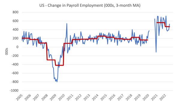
The first graph shows the monthly change in payroll employment (in thousands, expressed as a 3-month moving average to take out the monthly noise). The red lines are the annual averages. I left out the observations between January 2020 and September 2020, which were so extreme that they make it harder to compare the current period with the pre-pandemic history.
The US labour market has now exceeded the pre-pandemic level by 32 thousand jobs although the gains are not even across the sectors as detailed above.
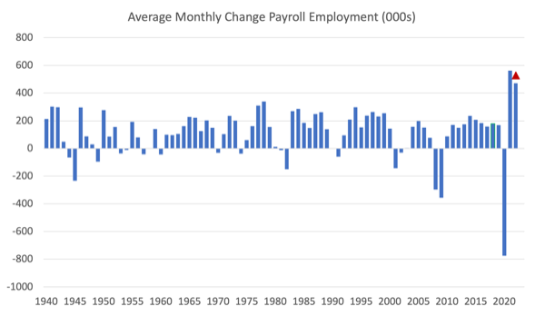
The next graph shows the same data in a different way – in this case the graph shows the average net monthly change in payroll employment (actual) for the calendar years from 2005 to 2021.
The red marker on the column is the current month’s result.
The final average for 2019 was 164 thousand.
The final average for 2020 was -774 thousand.
The final average for 2021 was 562 thousand.
The average so far in 2022 is 471 thousand.
Labour Force Survey – employment growth declines
The data for July 2022 reveals:
1. Total labour force survey employment rose by 179 thousand net (0.11 per cent).
2. The seasonally adjusted labour force fell by 63 thousand net (-0.04 per cent).
3. The participation rate fell by 0.1 points to 62.1 per cent.
4. As a result (in accounting terms), total measured unemployment fell by 242 thousand to 5,670 thousand and the official unemployment rate fell to 3.5 per cent (rounded to one decimal place).
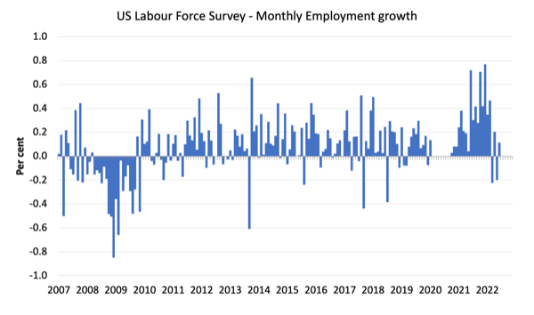
The following graph shows the monthly employment growth since January 2008 and excludes the extreme observations (outliers) between May 2020 and October 2020, which distort the current period relative to the pre-pandemic period.
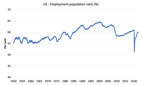
The Employment-Population ratio is a good measure of the strength of the labour market because the movements are relatively unambiguous because the denominator population is not particularly sensitive to the cycle (unlike the labour force).
The following graph shows the US Employment-Population from January 1950 to July 2022.
While the ratio fluctuates a little, the May 2020 ratio fell by 8.6 points to 51.3 per cent, which is the largest monthly fall since the sample began in January 1948.
In July 2022, the ratio rose by 0.1 points to 60 per cent on the back of a slowing working age population.
The peak level in May 2020 before the pandemic was 61.1 per cent.
Unemployment and underutilisation trends
The BLS note that:
In July, the unemployment rate edged down to 3.5 percent, and the number of unemployed persons edged down to 5.7 million. These measures have returned to their levels in February 2020, prior to the coronavirus (COVID-19) pandemic ….
The number of long-term unemployed (those jobless for 27 weeks or more) decreased by 269,000 in July to 1.1 million. This measure has returned to its February 2020 level. The long-term unemployed accounted for 18.9 percent of the total unemployed in July. …
The number of persons employed part time for economic reasons increased by 303,000 to 3.9 million in July. This rise reflected an increase in the number of persons whose hours were cut due to slack work or business conditions …
The reason the unemployment rate edged down is because the labour force shrank – had the participation rate not fallen by 0.1 per cent, then the unemployment rate would have been unchanged at 3.6 per cent.
So it is a false conclusion to relate the falling official unemployment rate to a strengthening labour market.
The first graph shows the official unemployment rate since January 1994.
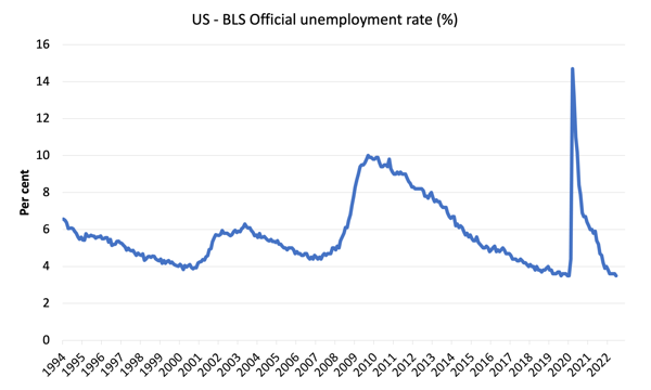
The official unemployment rate is a narrow measure of labour wastage, which means that a strict comparison with the 1960s, for example, in terms of how tight the labour market, has to take into account broader measures of labour underutilisation.
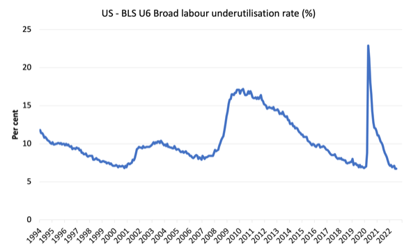
The next graph shows the BLS measure U6, which is defined as:
Total unemployed, plus all marginally attached workers plus total employed part time for economic reasons, as a percent of all civilian labor force plus all marginally attached workers.
It is thus the broadest quantitative measure of labour underutilisation that the BLS publish.
Pre-COVID, U6 was at 6.8 per cent (December 2019).
In July 2022 the U6 measure was 6.7 per cent, unchanged on the previous month.
Note, though the rise in workers forced to work part-time for economic reasons – which is the US indicator of underemployment.
What are wages doing in the US?
With inflation rising sharply at present and the Federal Reserve pretending there is a major wage problem that needs to be disciplined with rising mass unemployment, one would expect to see strong nominal wages growth pushing the price level along.
The BLS reported that:
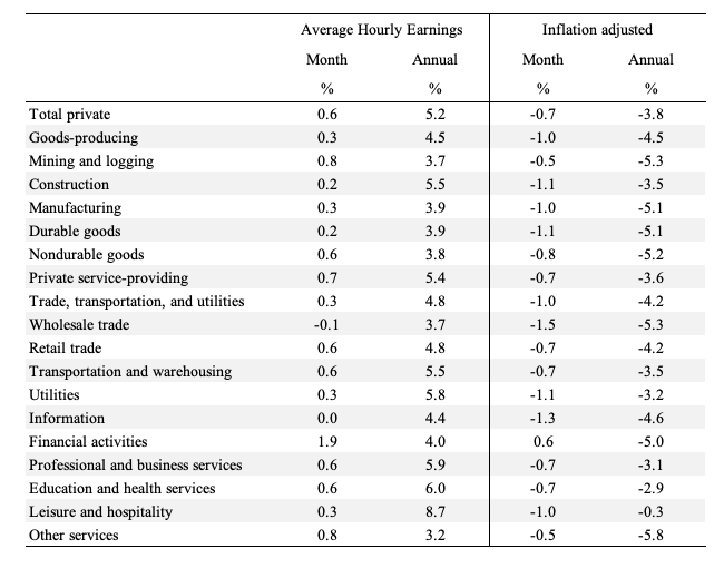
In July, average hourly earnings for all employees on private nonfarm payrolls rose by 15 cents, or 0.5 percent, to $32.27. Over the past 12 months, average hourly earnings have increased by 5.2 percent. In July, average hourly earnings of private-sector production and nonsupervisory employees rose by 11 cents, or 0.4 percent, to $27.57.
The following table shows the movements in nominal Average Hourly Earnings (AHE) by sector and the inflation-adjusted AHE by sector for July 2022 (note we are adjusting using the June CPI – the latest available).
Over the last month, real wages fell in all sectors.
We keep hearing that wages growth is a problem for US inflation.
But, if wages growth was pushing the inflation rate we would not be seeing persistent real wages cuts.
The following graph shows the annual hourly earnings growth for all private employees since May 2007.
Facts:
1. Since March 2022, the growth rate in average hourly earnings has been systematically declining.
2. The declining growth rate is well below the inflation rate.
3. Wages growth is not driving the supply-side inflation acceleration.
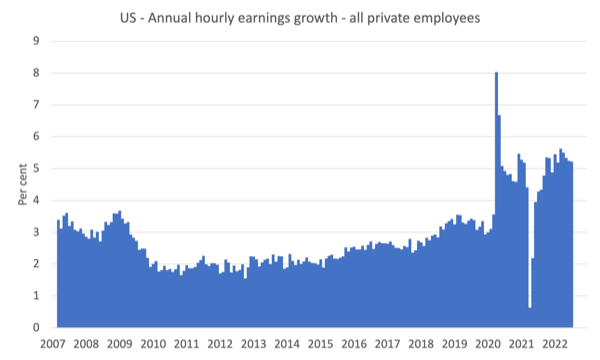
Note that the above graph is in nominal terms.
The latest – BLS Real Earnings Summary (published July 13, 2022) – tells us that:
Real average hourly earnings for all employees decreased 1.0 percent from May to June, seasonally adjusted … This result stems from an increase of 0.3 percent in average hourly earnings combined with an increase of 1.3 percent in the Consumer Price
Index for All Urban Consumers (CPI-U).Real average weekly earnings decreased 1.0 percent over the month due to the change in real average hourly earnings combined with no change in the average workweek.
Real average hourly earnings decreased 3.6 percent, seasonally adjusted, from June 2021 to June 2022. The change in real average hourly earnings combined with a decrease of 0.9 percent in the average workweek resulted in a 4.4-percent decrease in real average weekly earnings over this period.
Workers are not catching up with the price level rises and can hardly be said to be pressuring inflation.
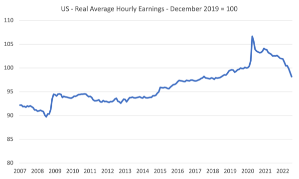
The following graph shows movements in real average hourly earnings (indexed at 100 at December 2019) up to July 2022 tells the story.
The spike in the early period of the pandemic was the result of hours adjustments rather than earnings growth.
And, from the latest – Productivity and Costs, First Quarter 2022, Revised (published June 2, 2022) – report, we find that:
Nonfarm business sector labor productivity decreased 7.3 percent in the first quarter of 2022 … as output decreased 2.3 percent and hours worked increased 5.4 percent. This is the largest decline in quarterly productivity since the third quarter of 1947, when the measure decreased 11.7 percent … From the same quarter a year ago, nonfarm business sector labor productivity decreased 0.6 percent, reflecting a 4.2-percent increase in output that was outpaced by a 4.8-percent increase in hours worked. This is the largest four-quarter decline since the fourth quarter of 1993, when the measure also declined 0.6 percent.
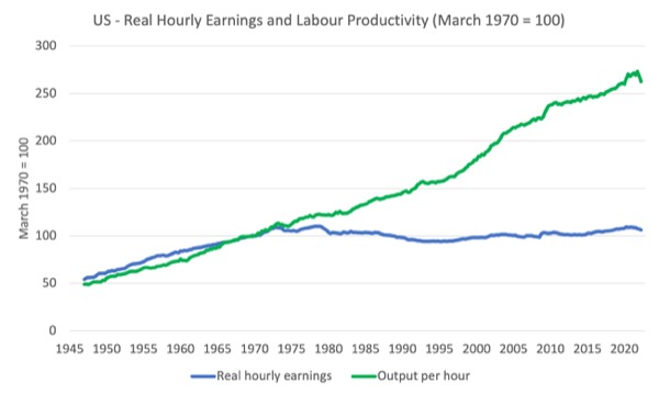
Even though productivity growth slumped in the first quarter of 2022, real hourly earnings growth continues to lag behind productivity growth over a longer period.
The following graph tells the story (up to the June-quarter 2022).
It shows real hourly earnings and labour productivity (output per hour) indexed at 100 in the May-quarter 1970 (around the time the two series started to diverge).
Workers have gained hardly any real wages growth since 1970 (rising by just 5.7 per cent) whereas productivity growth has risen by 162 per cent.
There has been a massive redistribution of national income away from workers towards profits over this long period.
This depicts the failure of Capitalism to serve the best interests of the people.
Conclusion
In July 2022, the US labour market produced reasonable growth in employment but at the same time the participation rate fell.
The fall in the official unemployment rate was all down to the declining participation rate.
There are no fundamental wage pressures emerging at present despite the spikes in inflation arising from supply chain constraints.
Real wages fell for the fourth consecutive month.
That is enough for today!
(c) Copyright 2022 William Mitchell. All Rights Reserved.
I think the final chart is as much an example of government failure and being captured by big business as it is a failure of capitalism.
“an example of government failure …”
You mean the capitalists made a mistake by investing in Government. Who’s going to tell them that?
“You mean the capitalists made a mistake by investing in Government.”
No, I don’t mean that. Assume you are being sarcastic 🙂
“Assume you are being sarcastic :)”
Sarcasm works, I guess, but I was more off-topic. On reflection, I think I got the whole point backwards.
it is a similar story here in the uk.However temporary current inflation rates are this episode
is far worse than the inflationary episode in the 1970’s for working people.We are looking at
record falls in inflation adjusted income.
No doubt the ruling classes will seek to exploit this ,the two candidates for our next prime minister
Trying to out do each other with ideas for new legalisation to stop rail workers and others being
able to strike .
No ideas from our ‘labour’ leaders how to mitigate this record fall in workers income and let’s be
honest no ideas on this blog either.
You are right about the 1970s, Kevin. The 1973 jump in oil prices affected me particularly because we’d just bought our first house which had oil central heating My first experience of inflation was the UK’s adoption of metric currency in 1971 when the prices in shops did jump, but it was a one-off. However, wages kept pace with inflation throughout. There were other reasons why we continued to struggle financially.
Kevin harding wrote, “… let’s be honest no ideas on this blog either.”
I have suggest more “stimulus checks”. Nobody likes that idea.
Employment is also a supply problem (demographic shift).
Unemployment measurement https://johnmenadue.com/one-hour-a-week-counts-as-employed-it-doesnt-matter/. The measured/reported unemployment rate has become imprinted on the public mind as a real measure of the “meaningful” rate of unemployment. I perceive that there is a layperson’s view extant that being employed somehow equates to having a livable income, at least for those employed past the youth/full time student employment level. Would a better understanding of the real world be provided if there was provided, say, what might be called a wellbeing employment (rate) of society. Pollies, economists and journos concentrate on the headline unemployment rate and ascribe a (unstated) meaning to that number which seems completely false and unwarranted as it’s taken as a basis for government assumptions/policy/action regarding the economy as it impinges on society.
Thinking and reporting about the unemployment stats without looking behind the what and how of the numbers that are collected and understood seems to be an absurdity. Bill does look in detail behind the numbers but there’s not much going on out there in MSM. When, in an economists’ world, everyone seeking employment was employed for one hour per week then there would be 0% unemployment = perfection – an extremely unlikely scenario as I expect we would be in revolution well before then. How does a measure that leads to such a logical conclusion make sense to a livable society?
Wouldn’t it be more meaningful to compare how the level of unemployment/employment, as conventionally measured, looks relative to a measure of, say, a (full time employed, single job) minimum age individual livable wage threshold (poverty level +x%?) equivalent compared to the employed total? Would something along those lines give a better handle on underemployment, size and growth of gig/part-time employment and a better idea of the proportion of the employed having the financial capacity for a level of comfortable existence in society?
The government/RBA/MSM just seem to pump up the headline low unemployment number which gets used as a shield for raising interest rates, playing on the general misunderstandings of the people. Those interest rate rises flow through to damage the bottom income group by adding to debt burdens on or near the limit of capacity to repay. It acts as a mechanism for further wealth transference from the have nots to the have yachts.
As I read recently: “Nothing is as important as getting the people to understand the economics & to organize around that understanding. Nothing. All the feelings and sensibilities don’t mean much other than acknowledging a righteous powerlessness when a bad government passes a bill with austerity baked into it only to have well to do bad guys celebrate deficit reduction.”
Word for today: pigovian/pigouvian, as in pigovian tax.