Today (March 6, 2024), the Australian Bureau of Statistics released the latest - Australian National…
Australian national accounts – wage share at record low while corporate profits boom – this is not right!
The Australian Bureau of Statistics released the latest – Australian National Accounts: National Income, Expenditure and Product, June 2022 – today (September 7, 2022), which shows that the Australian economy grew by 0.9 per cent in the June-quarter 2022 and by 3.3 per cent over the 12 months to the end of June 2022. Growth is being driven by a combination of household spending (which has not yet succumbed to the cost of living squeeze exacerbated by the ridiculous interest rate rises) and a booming export sector (on the back of strong terms of trade). The problem is that while the on-going productivity growth has provided scope for non-inflationary real wage rises, real wages are going backwards. The problem is that business are pocketing these productivity gains as profits. The wage share fell further to a record low of 48.5 per cent which is a shocking testimony of the way the wages system is penalising workers. That needs to stop and the government should do something about it.
The main features of the National Accounts release for the December_quarter 2021 were (seasonally adjusted):
- Real GDP increased by 0.9 per cent for the quarter. The annual growth rate was 3.6 per cent
- Australia’s Terms of Trade (seasonally adjusted) grew by 4.6 per cent in the quarter and by 7.5 per cent over the 12 month period. The rise in commodity export prices outweighed the rising import prices.
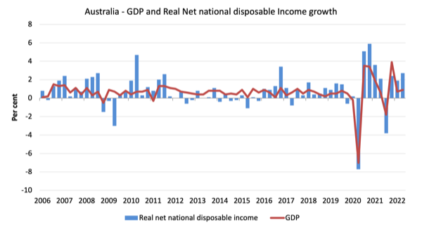
- Real net national disposable income, which is a broader measure of change in national economic well-being rose by 2.7 per cent for the quarter and 3 per cent over the 12 months, which means that Australians are better off (on average) than they were at that point 12 months ago.
- The Household saving ratio (from disposable income) fell from 11.4 per cent to 8.7 per cent.
Overall growth picture – growth continues at slower rate
The ABS – Media Release – said that:
Rises in household spending and exports drove growth in the June quarter. This is the third consecutive quarter of economic growth, following a contraction in the September quarter 2021, which was impacted by the Delta outbreak …
Households increased spending on domestic and international travel as COVID restrictions further eased and international borders remained open. While spending on transport grew strongly, households were still only spending two thirds of what they did pre-pandemic …
The household saving to income ratio fell for the third consecutive quarter, from 11.1 per cent to 8.7 per cent, as the increase in household spending outpaced growth in household income …
Exports recorded the strongest quarterly rise since the Sydney Olympics boosted travel exports in September quarter 2000
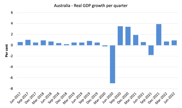
The first graph shows the quarterly growth over the last five years.
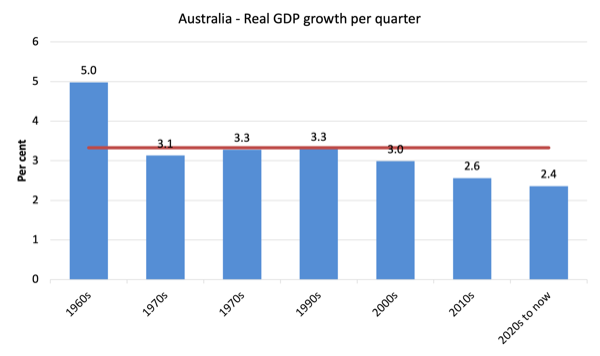
To put this into historical context, the next graph shows the decade average annual real GDP growth rate since the 1960s (the horizontal red line is the average for the entire period (3.3 per cent) from the June-quarter 1960 to the June-quarter 2022).
The 2020-to-now average has been dominated by the pandemic.
But, it is also obvious how far below historical trends the growth performance of the last 2 decades have been as the fiscal surplus obsession has intensified on both sides of politics.
Even with a massive household credit binge and a once-in-a-hundred-years mining boom that was pushed by stratospheric movements in our terms of trade, our real GDP growth has declined substantially below the long-term performance.
The 1960s was the last decade where government maintained true full employment.
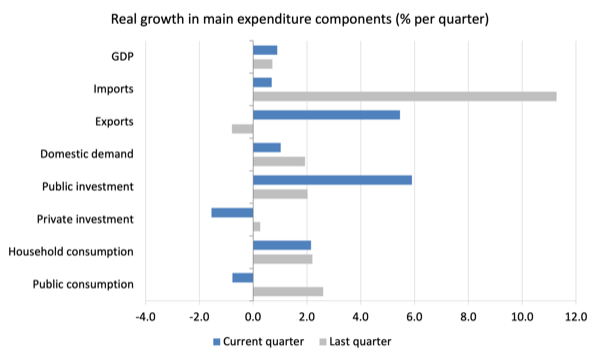
Analysis of Expenditure Components – Consumption and Exports
The following graph shows the quarterly percentage growth for the major expenditure components in real terms for March-quarter 2022 (grey bars) and the June-quarter 2022 (blue bars).
Points to note:
1. Household Consumption expenditure rose by 2.2 per cent in the June-quarter and is now well above the pre-pandemic level.
2. General government consumption expenditure fell by 0.8 per cent in the June-quarter but was 6 per cent higher over the 12 months.
3. Private investment expenditure growth fell by 1.6 per cent for the quarter and by 0.7 per cent over the year.
4. Public investment grew by 5.9 per cent for the quarter and was up 3.5 per cent for the year, as a result of some very large state-level infrastructure projects.
5. Export expenditure rose by 5.5 per cent for the quarter and 4.9 per cent over the 12 months. Imports growth was just 0.7 per cent in the June-quarter but grew by 10 per cent for the year (a lot of travel going on after none!).
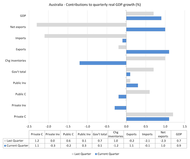
Contributions to growth
What components of expenditure added to and subtracted from the 0.8 per cent rise in real GDP growth in the June-quarter 2022?
The following bar graph shows the contributions to real GDP growth (in percentage points) for the main expenditure categories. It compares the June-quarter 2022 contributions (blue bars) with the December-quarter 2021 (gray bars).
In no order:
1. Household consumption expenditure added 1.1 points to the overall growth rate of 0.9 per cent.
2. Public Investment added 0.3 points.
3. Growth in inventories was a negative contributor as firms ran down stocks leading to a -1.2 point contribution.
4. Private investment expenditure undermined growth by 0.3 points.
5. Public consumption undermined growth by 0.2 points. Overall, the government sector added 0.1 points.
5. Net exports reduced growth by 1 point with exports (1.1) being partially offset by imports -0.1 points (remember imports are a drain on expenditure).
Material living standards rose in June-quarter
The ABS tell us that:
A broader measure of change in national economic well-being is Real net national disposable income. This measure adjusts the volume measure of GDP for the Terms of trade effect, Real net incomes from overseas and Consumption of fixed capital.
While real GDP growth (that is, total output produced in volume terms) rose by 0.9 per cent in the June-quarter, real net national disposable income growth rose by 2.7 per cent.
How do we explain that?
Answer: The terms of trade rose strongly – meaning our exports boomed in value terms.
The following graph shows the evolution of the quarterly growth rates for the two series since the June-quarter 2006.
Household saving ratio fell by 2.4 points to 8.7 per cent
The ABS noted that:
Household saving fell as the rise in household spending outpaced growth in gross disposable income. Household gross disposable income rose 1.0%, driven by gross income. Labour income (COE) increased in line with strong labour market conditions. This was partly offset by non-life insurance claims, which fell back to more normal levels following major flood events in New South Wales and Queensland in March quarter.
Income payable detracted from growth in gross disposable income, driven by income tax and interest paid. This is consistent with strong labour market outcomes and increases in interest rates during the quarter.
The following graph shows the household saving ratio (% of disposable income) from the June-quarter 2000 to the current period. It shows the period leading up to the GFC, where the credit binge was in full swing and the saving ratio was negative to the rise during the GFC and then the most recent rise.
The current position is that households are being squeezed by a combination of rising living costs and interest rates and flat wages growth, which is driving a gap between income and expenditure, which is being funded by a declining saving ratio.
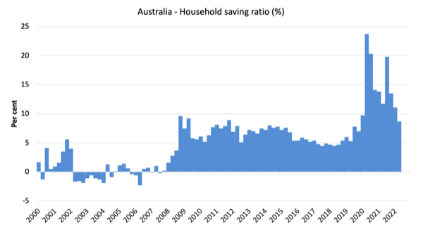
While the saving ratio might appear to be still very high, if we take a longer term view of it, the behaviour is less ‘historic’ than we might think.
The next graph shows the household saving ratio (% of disposable income) from the June-quarter 1960 to the current period.
Back in the full employment days, when governments supported the economy and jobs with continuous fiscal deficits (mostly), households saved significant proportions of their income.
In the neoliberal period, as credit has been rammed down their throats, the saving rate dropped (to negative levels in the lead-up to the GFC).
Hopefully, households are paying off the record levels of debt they are now carrying and improving their financial viability.

The following table shows the impact of the neoliberal era on household saving. These patterns are replicated around the world and expose our economies to the threat of financial crises much more than in pre-neoliberal decades.
The result for the current decade (2020-) is the average from March 2020.
| Decade | Average Household Saving Ratio (% of disposable income) |
| 1960s | 14.4 |
| 1970s | 16.2 |
| 1980s | 12.0 |
| 1990s | 5.1 |
| 2000s | 1.4 |
| 2010s | 6.4 |
| 2020- | 14.6 |
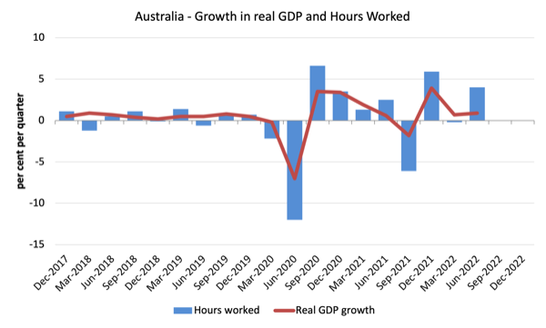
Real GDP growth rose but so did working hours – resulting in drop in labour productivity growth
The following graph presents quarterly growth rates in real GDP and hours worked using the National Accounts data for the last five years to the June-quarter 2021.
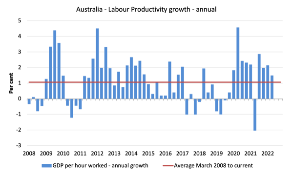
To see the above graph from a different perspective, the next graph shows the annual growth in GDP per hour worked (labour productivity) from the June-quarter 2008 quarter to the June-quarter 2022. The horizontal red line is the average annual growth since June-quarter 2008 (1.1 per cent), which itself is an understated measure of the long-term trend growth of around 1.5 per cent per annum.
The relatively strong growth in labour productivity in 2012 and the mostly above average growth in 2013 and 2014 helps explain why employment growth was lagging given the real GDP growth. Growth in labour productivity means that for each output level less labour is required.
The data shows that both while real output rose by 0.9 per cent, hours worked rose by 4 per cent during the June-quarter.
The result is that GDP per hours worked fell from 2.2 per cent to 1.5 per cent on an annual basis.
The productivity growth provides the ‘room’ for real wages to grow without putting upward pressure on the inflation rate.
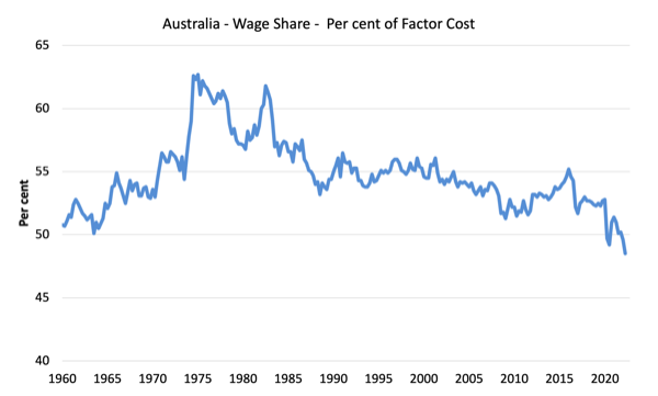
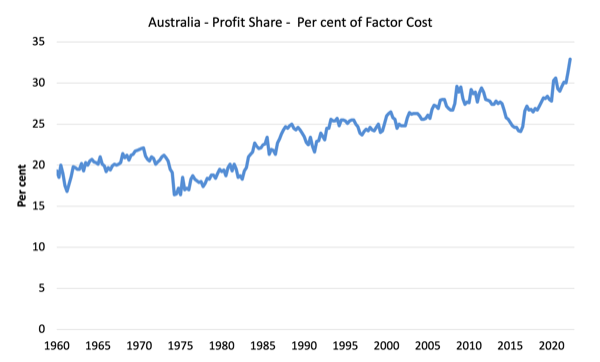
The distribution of national income – with real wage cuts and productivity rising – the wage share plummets further
The wage share in national income fell by 0.9 points to 48.5 per cent while the profit share rose by 1.5 points. The terms of trade rise has boosted profits without the gains being shared with workers via higher wages growth.
This is one of the major problems facing the new government.
For those who claim wage rises will exacerbate the current inflation situation – they should realise that with productivity growth, there is scope for non-inflationary real wage rises.
The problem is that business are pocketing the productivity gains as profits. That needs to stop and the government should do something about it.
The first graph shows the wage share in national income while the second shows the profit share.
The declining share of wages historically is a product of neoliberalism and will ultimately have to be reversed if Australia is to enjoy sustainable rises in standards of living without record levels of household debt being relied on for consumption growth.
Conclusion
Remember that the National Accounts data is three months old – a rear-vision view – of what has passed and to use it to predict future trends is not straightforward.
The data tells us that after the initial rebound from the lockdowns, growth continued to be moderate in the June-quarter and was driven by domestic demand – household consumption, government spending and the booming terms of trade (on the back of the issues in Ukraine and elsewhere).
The terms of trade gains, however a not being shared by workers as corporations pocket increased profits.
Some of those profits are at the expense of Australian households who are now paying muvh higher energy prices while our domestic gas production is being diverted to markets where much higher prices again are being offered (Europe).
So on the back of disasters (war, floods etc), corporations are increasing their profits while the rest of us are going backwards.
Some system!
The wage share fell further to a record low of 48.5 per cent which is a shocking testimony of the way the wages system is penalising workers.
That is enough for today!
(c) Copyright 2022 William Mitchell. All Rights Reserved.
Why are you using GDP instead of per capita GDP?
Especially since immigration has been near zero since March 2020 (in contrast to the frantic immigration prior to that)
Its also a far more valid measure of wellbeing and productivity